Style-Main Layout
Style Main Layout
The bitweaver framework has always provides a range of layout options, but with the increasing need to manage more flexible device layouts for mobile and other small format devices it has become necessary to simplify the base. This does not prevent manually modifying the core layout with a custom skin, something which is fundamental to bitweaver, but working within the guidelines ensures that compatibility is maintained across all devices and more important, browsers.
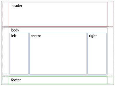
The standard core follows a traditional header-body-footer with additional left and right blocks being supported in the body area.
While the main development team has moved over to bootstrap as the css framework for theme development, it's lack of support for full colour icons and screen elements seems like a backwards step, so we had adopted the ink framework which gives a little more flexibility to colour options, and had merged this with the jquery-ui colour library for element colours. None of the available options are ideal, but the MVC structure of bitweaver allows this to be adapted to a suitable combination which provide a reasonable colour library, and the recent changes in Bootstrap 3 fixed a number of the problems provided by BW2. It now allows a reasonable responsive layout but still needs som custom modification to restore a tidy full colour icon and layout support. We have created a base ColourStrap framework based on the BS3 base, but using a silk icon based icon library which matches the CKEdittor colour style.
The basis of the new responsive framework is a folding structure based on a number of key screen widths. This starts at 300 pixels for the mobile phone type devices, switching to a 600px base for smaller tablet type devices and 1000 pixel for high resolution tables and desktop. If appropriate a 1920 pixel level can also be supported, but a reasonable compromise is a fluid design that fill the full width of a wide screen display but uses the large style elements to populate it. For a base design we use a set of three banner bars which have the same height but different widths as this works best as a site scales. The base set being 300x165, 600x165 and 1000x165 images, but these can be adjusted as long as the base widths are retained to match the best compromise width for each type of device. A full explanation of widths will be added later.
We support these options with a number of preset elements starting with the Font Gallery and will augment that with an expandable icon library and a selectable colour pallet.
The first area of control provided is whether to use fixed width or full width display areas for the three main sections. These can be individually selected in the Theme Column Layout page of the admin control panel.
