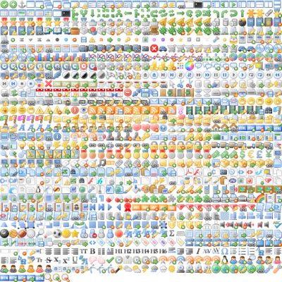
Style-Icon Library
Style Icon Library
While the current drive is to use 'font' style icons which are essentially monochrome, maintaining full colour is not a problem using CSS Sprites to replace the traditional individual icon images. This is a good compromise and creates less overhead then the font approach currently being pushed.
The gnome icon set was originally renamed to match the 'FontAwesome' naming convention, but an alternative is provided by the silk icon library which better matches those icons used internally in ckeditor. It is somewhat annoying that the developers of these new icon libraries did not follow what is a well documented standard for icons, choosing instead to re-invent the wheel. Since the established libraries have several hundred available icons, the font sets couple of hundred can be a little restrictive, but since they are all the same colour, there is no option to select one of several colours for the legacy icons.
http://css.spritegen.com/ provides an on-line method of creating icon sprite maps and is a useful tool while we are developing alternatives


